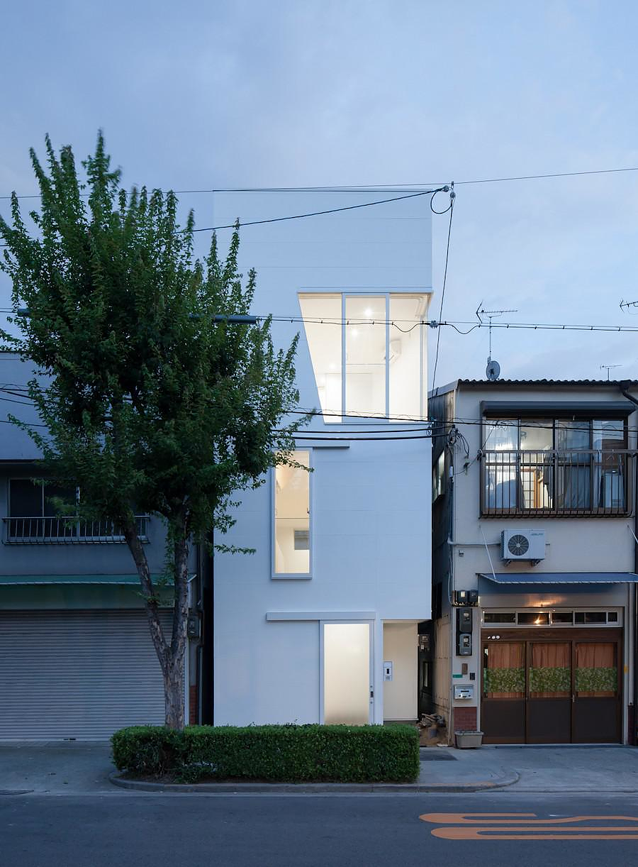
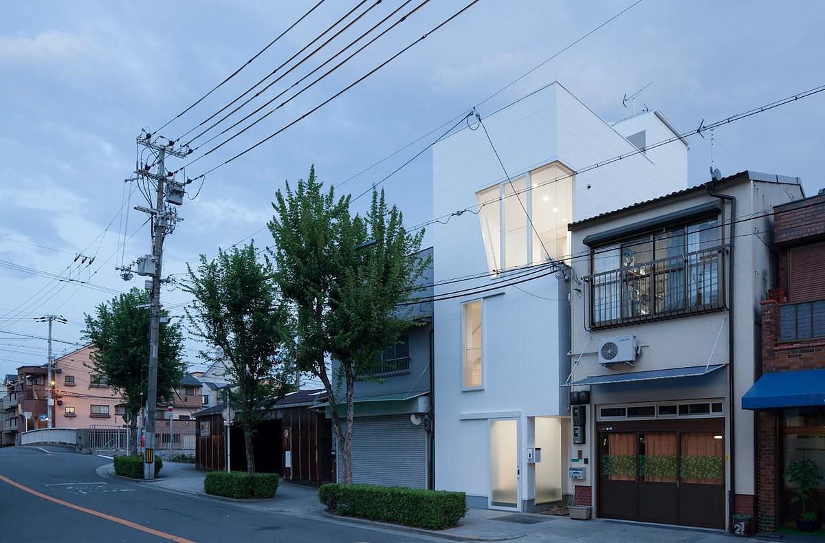
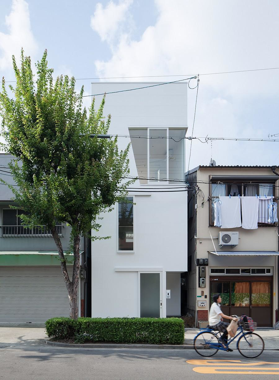
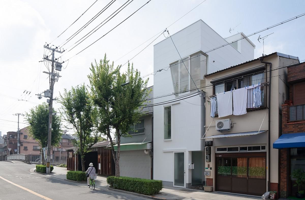
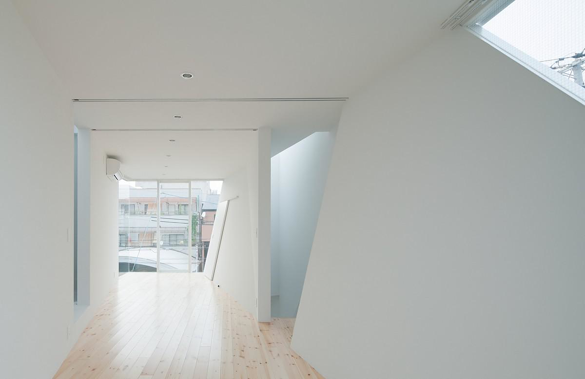
With its simple straight lines, clean rectangular shape and its materials showing their natural shades and textures, the residence in Tamatsu area, in Osaka, Japan by Kenji Ido is a perfect example of minimal Japanese architecture. The house in Tamatsu is a carefully designed white box that stands out from its traditional and dim surroundings.
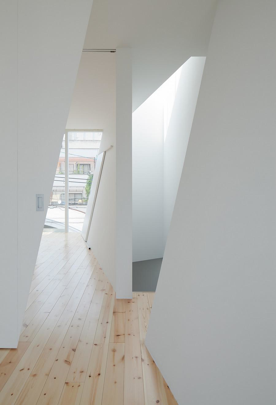
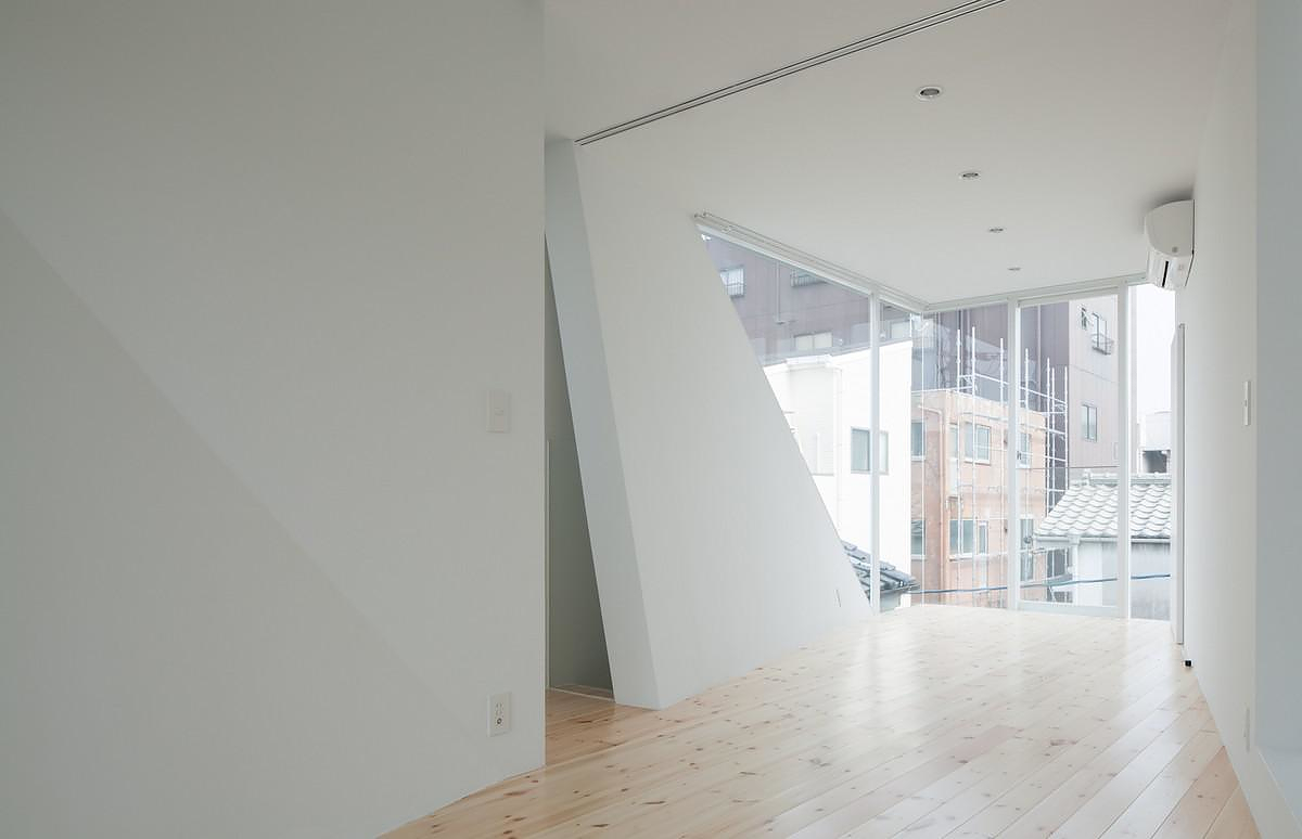
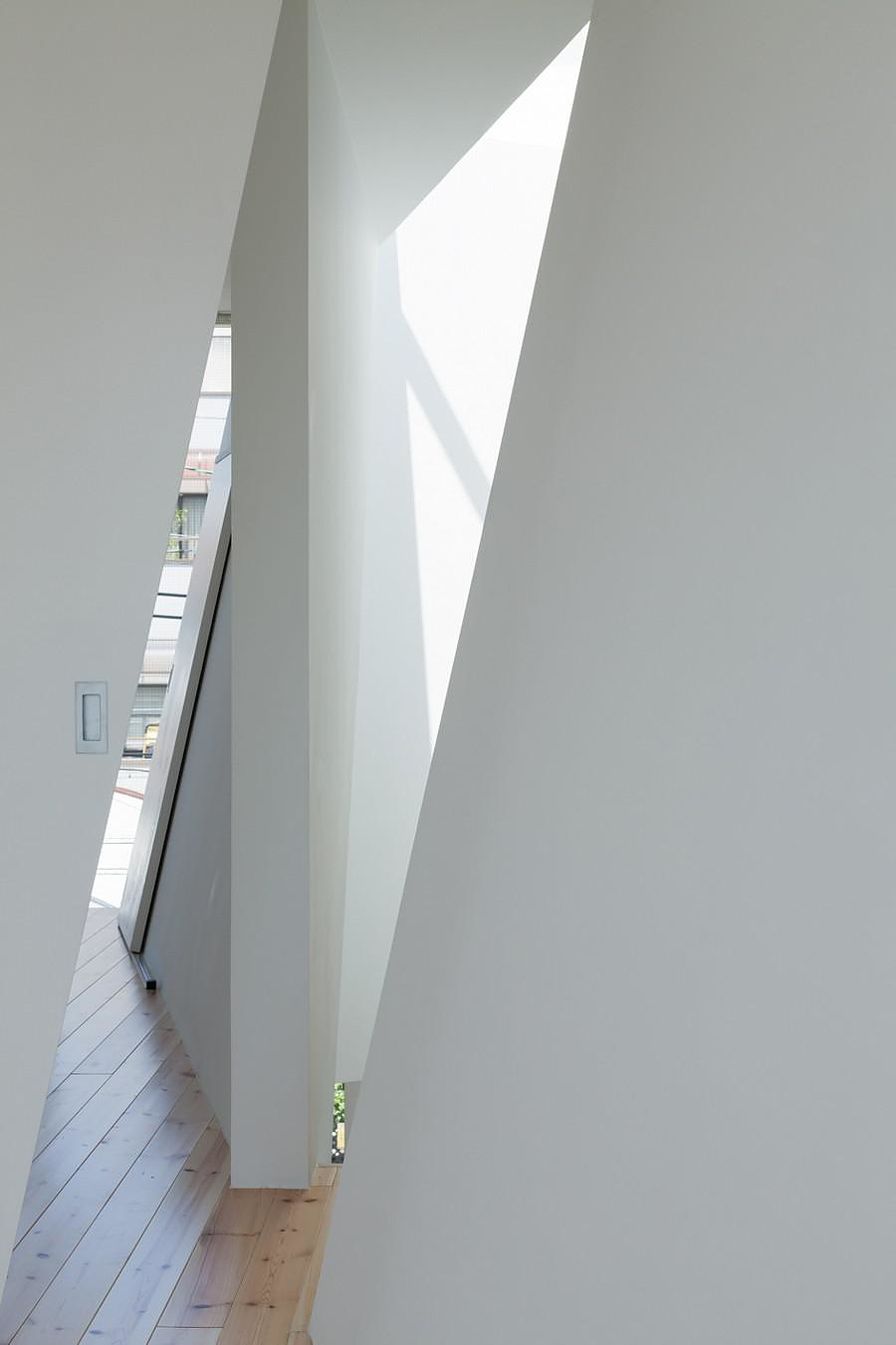
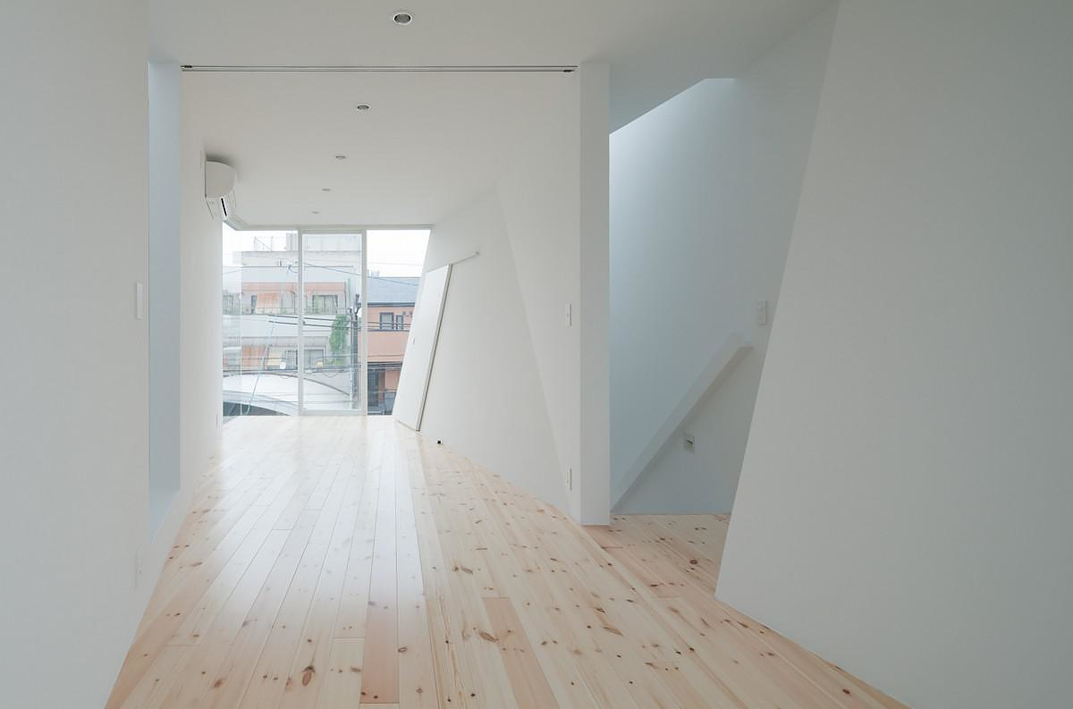
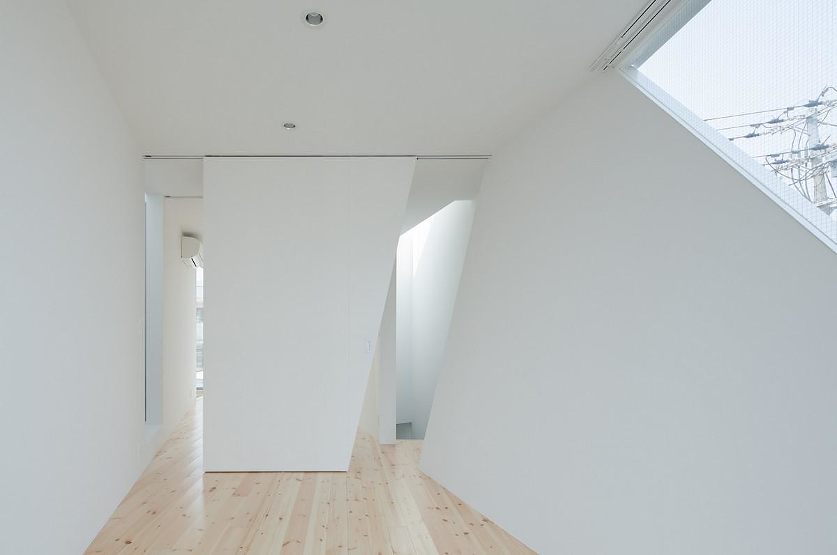
Japanese architect, Kenji Ido, presents a fresh interpretation of the modern architectural movement. Kenji Ido funded the Kenji Architectural Studio in 2003. The house in Tamatsu is his latest work, it was designed for a family of four and was completed just one year ago. The main challenge of the project was to ensure that as much as possible natural light would reach the interior, so as to create a bright and pleasant residential space. This is accomplished by the ingenious use of triangular openings and by rotating the internal walls’ axe in the second floor.
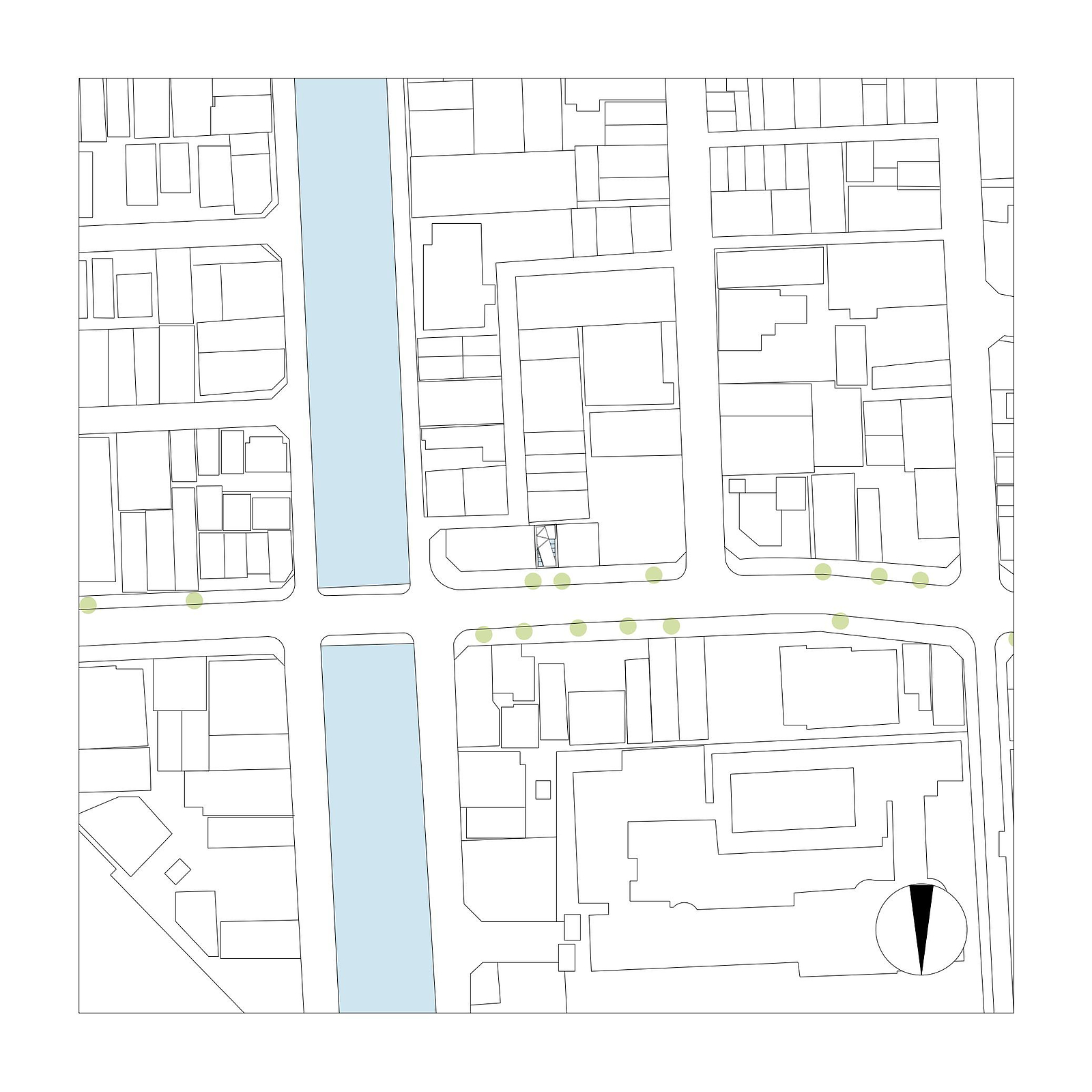
This design problem might seem easy at first, but with attached buildings on both sides of a very narrow site measuring just 95 square meters, as well as a structural problem which prevented large openings on the first floor’s main façade, it turned into a big challenge. Kenji Ido saw this problem as an opportunity for proposing a simple yet innovative solution.
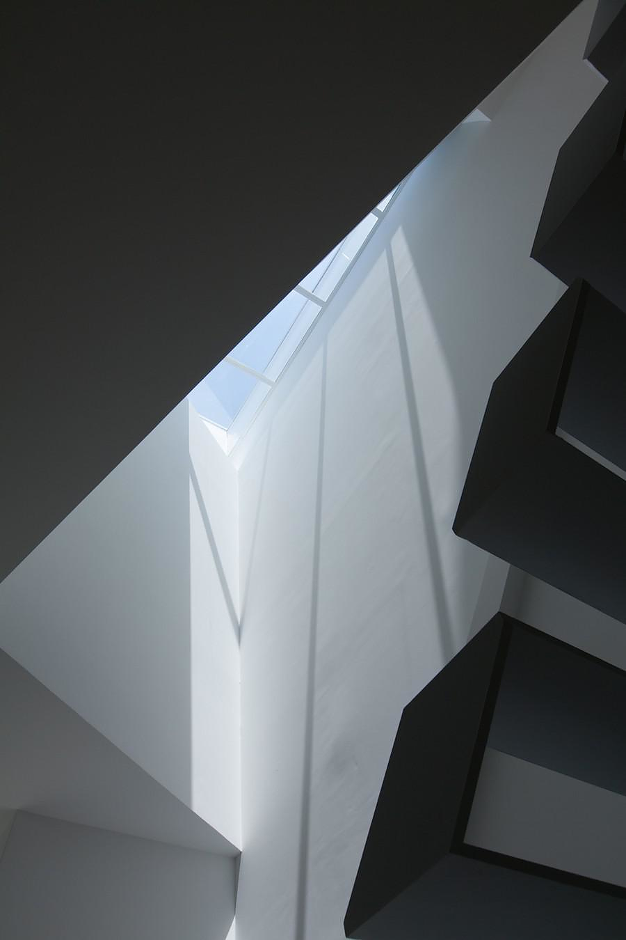
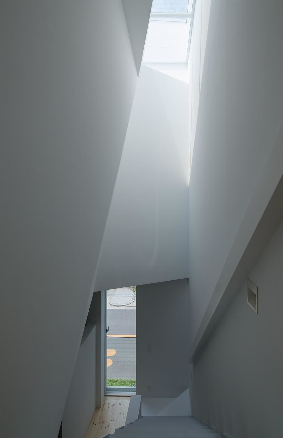
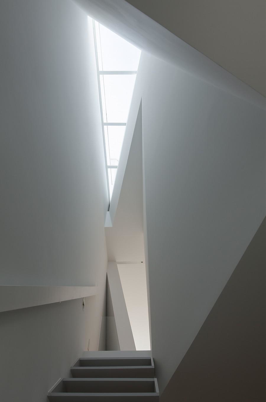
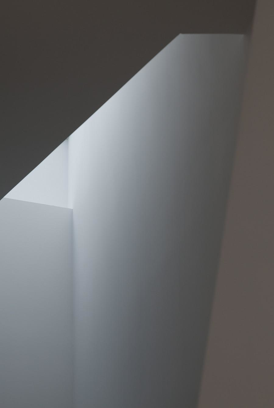
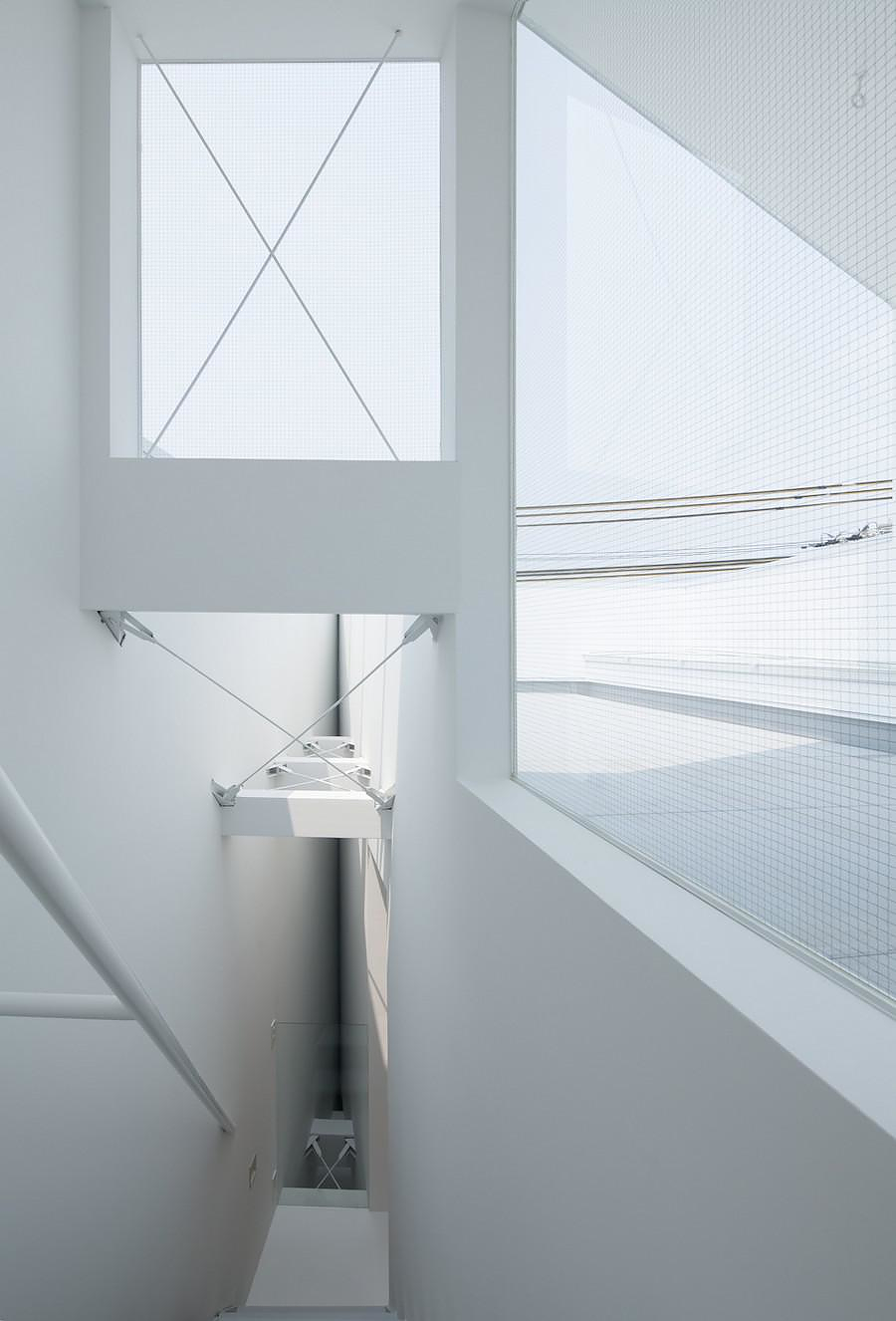
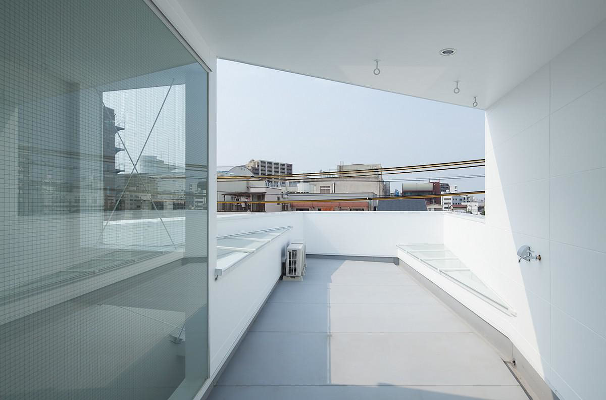
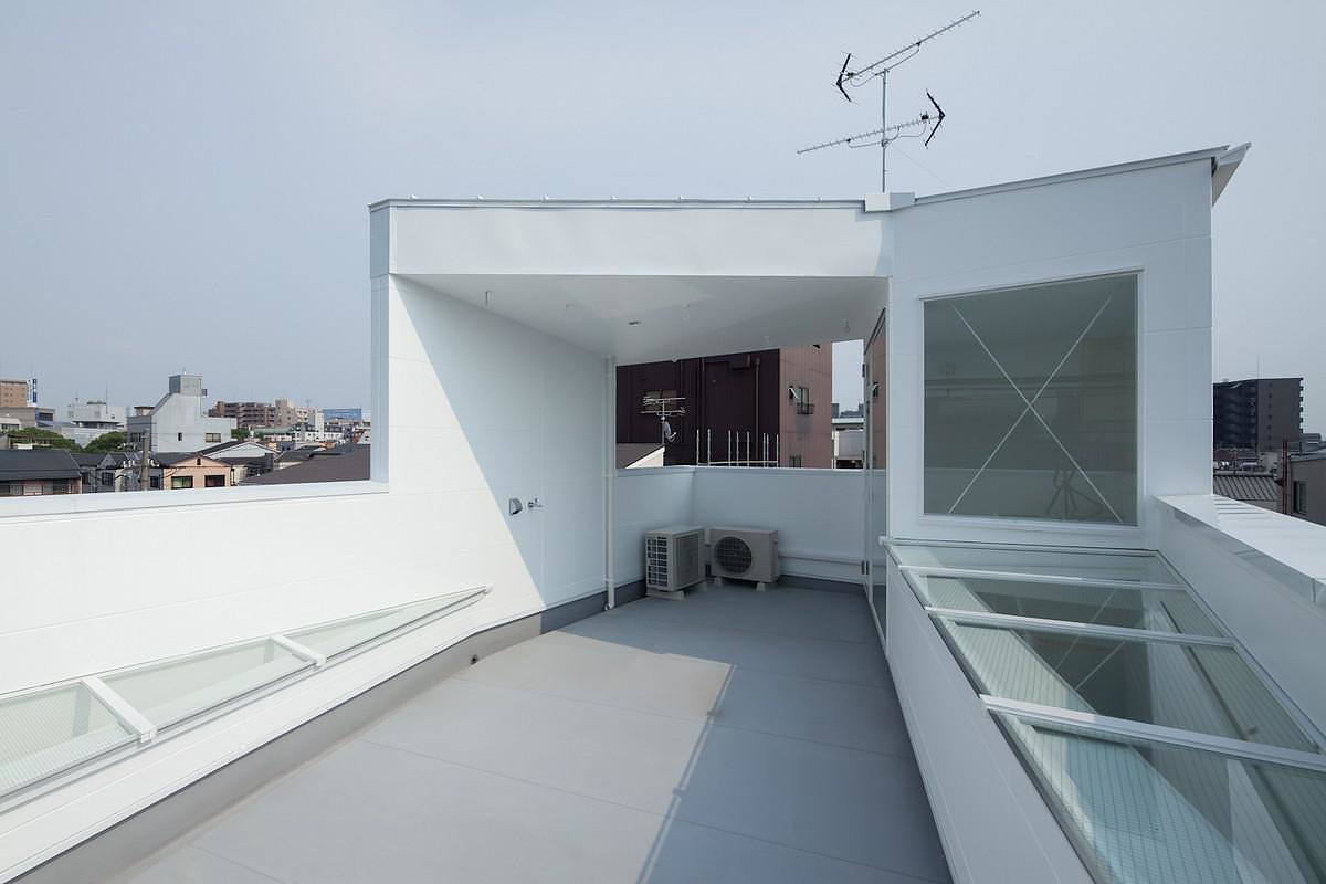
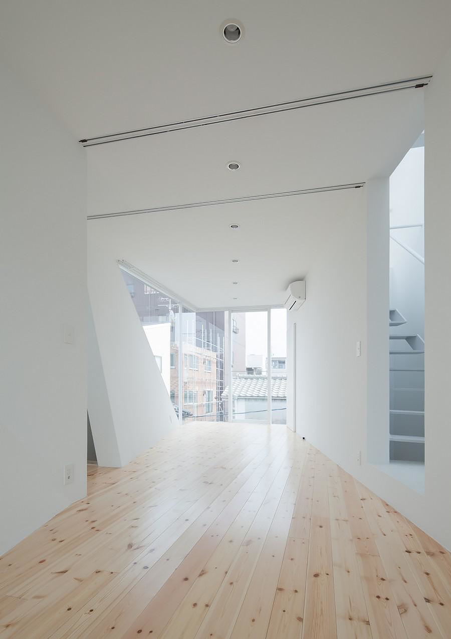
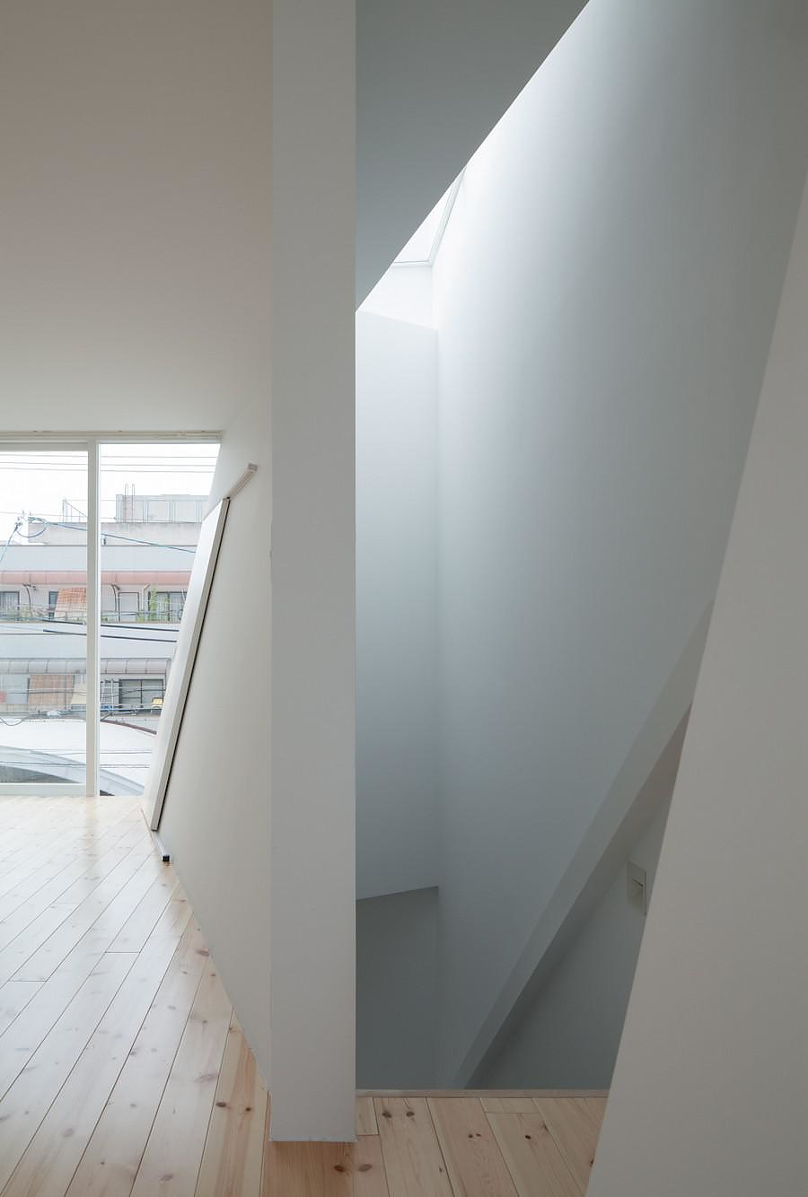
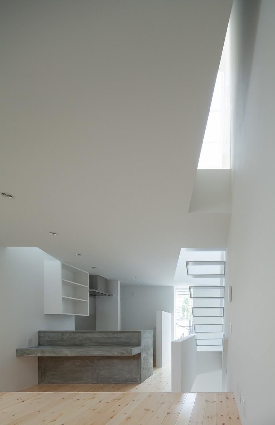
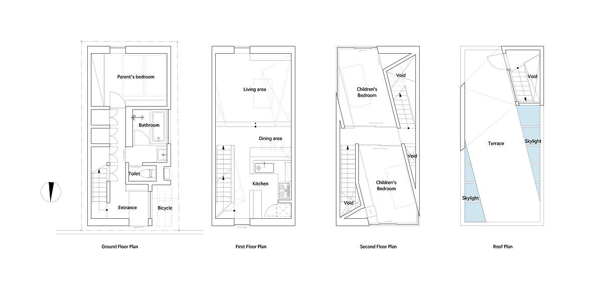
The family’s lifestyle required that the master bedroom and wet spaces are situated on the ground floor, while the main spaces, namely the living room, kitchen and dining room should be located on the first floor. This means that the problematic first floor accommodates activities that need as much light as possible. Kenji Ido impresses us by rotating the internal walls’ axe of the second floor at 14 degrees and creating rectangular openings on the floor. On the terrace there are two skylights with the same rectangular shape with the second floor’s opening, covering them and allowing natural light to flow into the house.
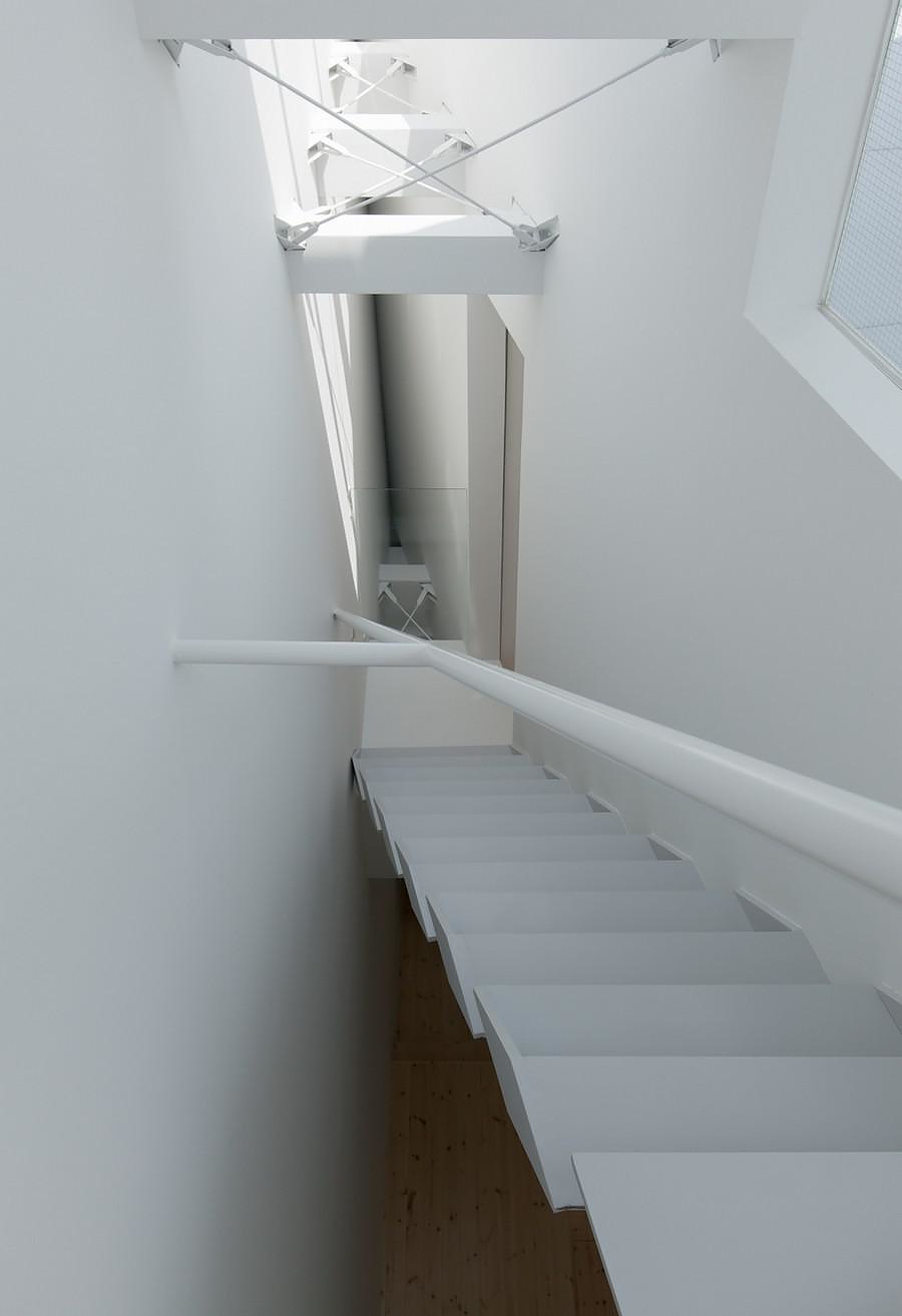
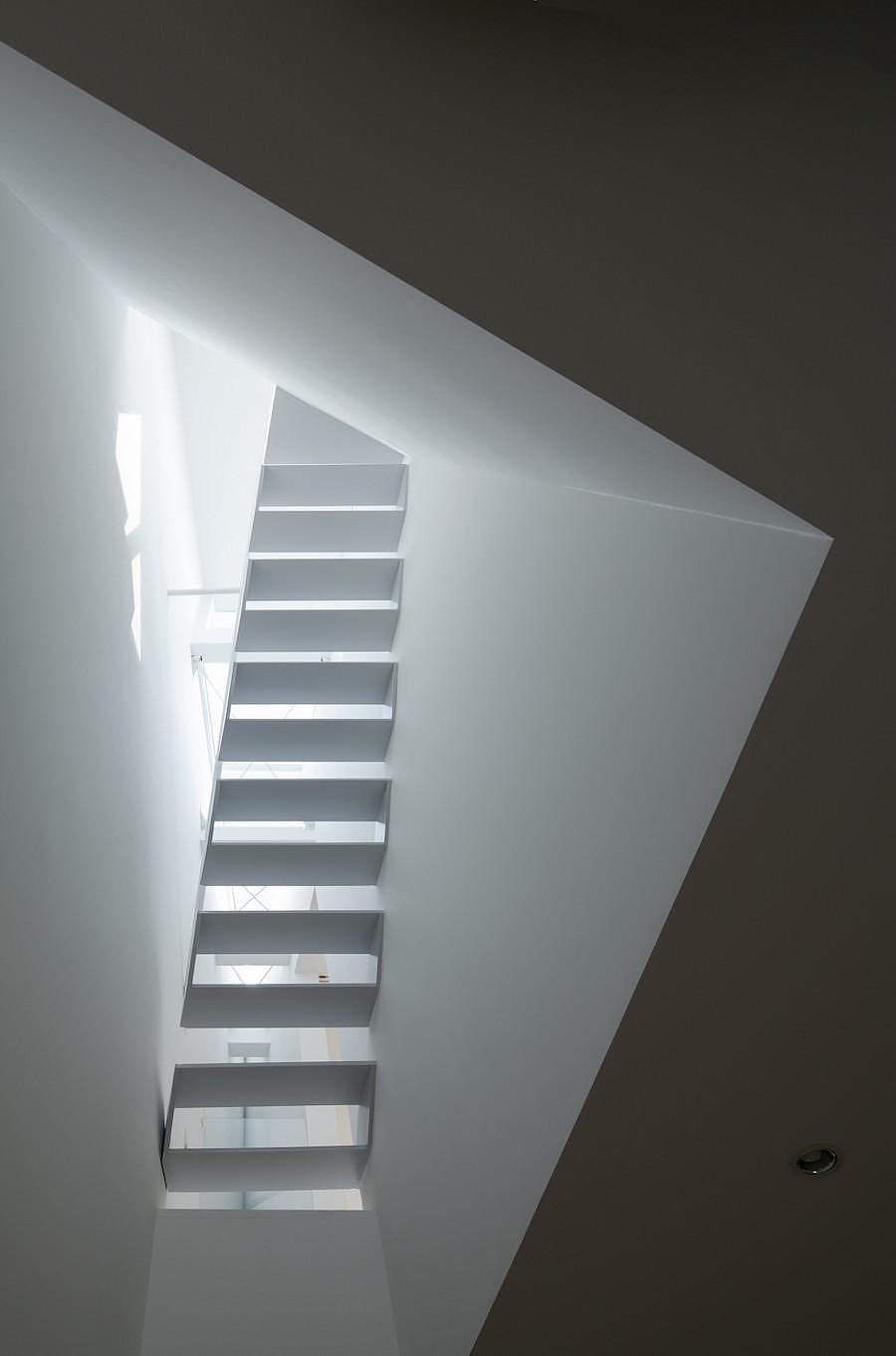
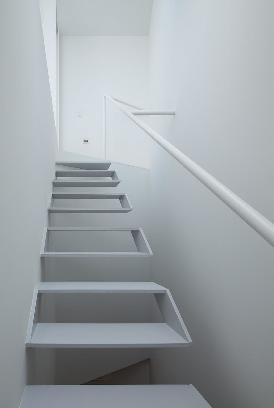
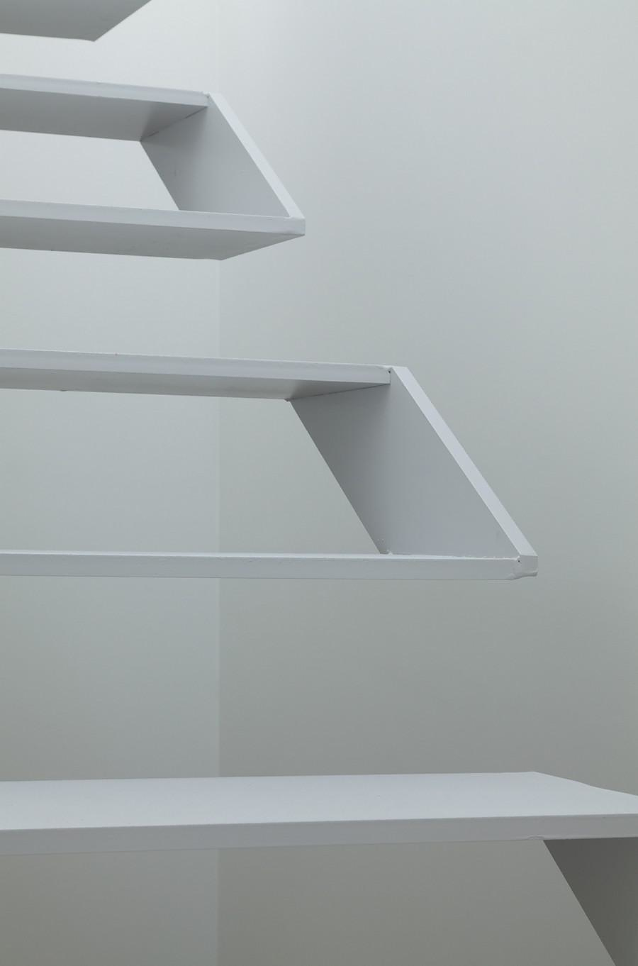
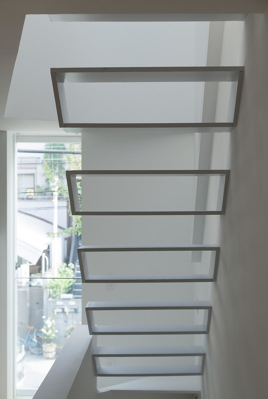
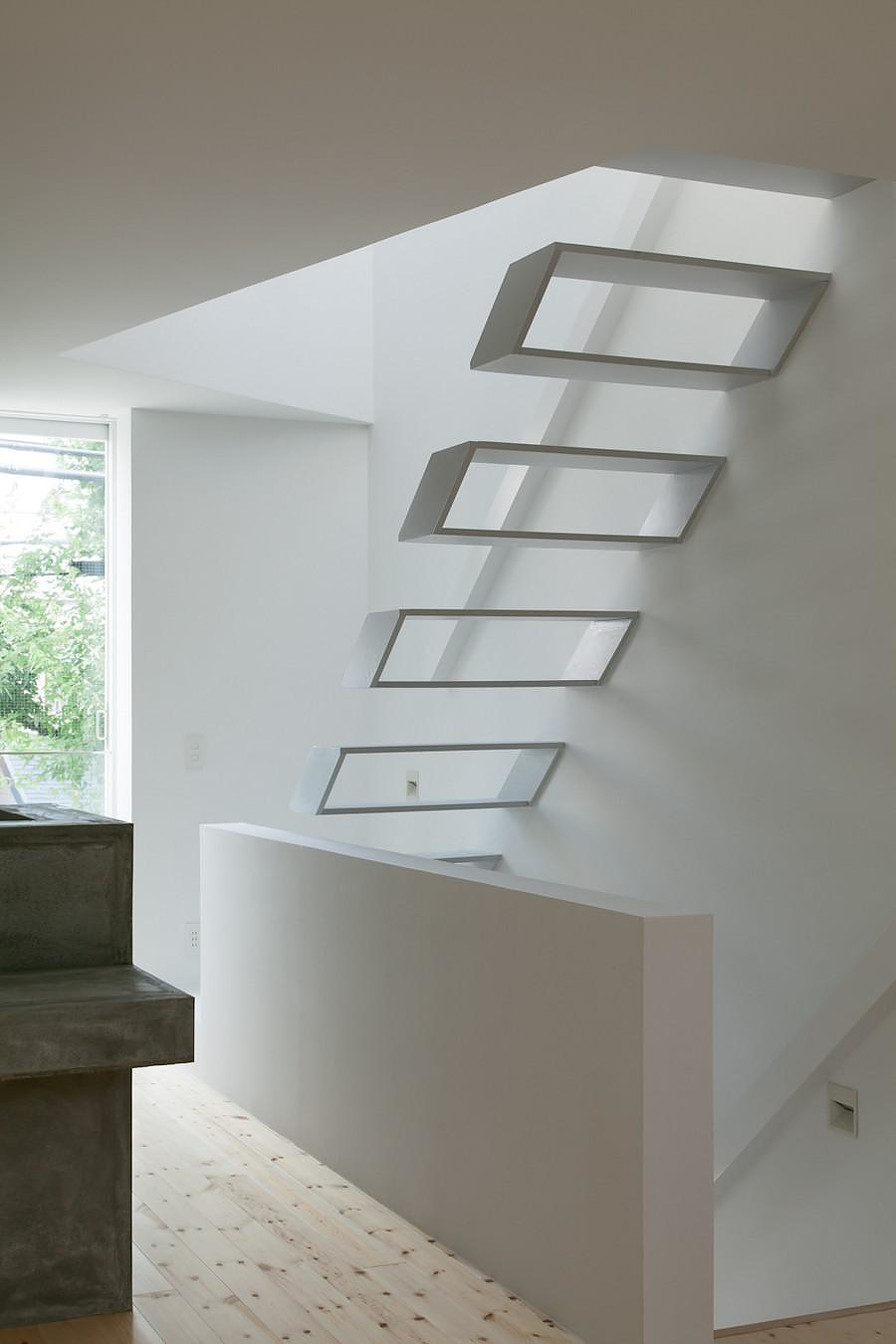
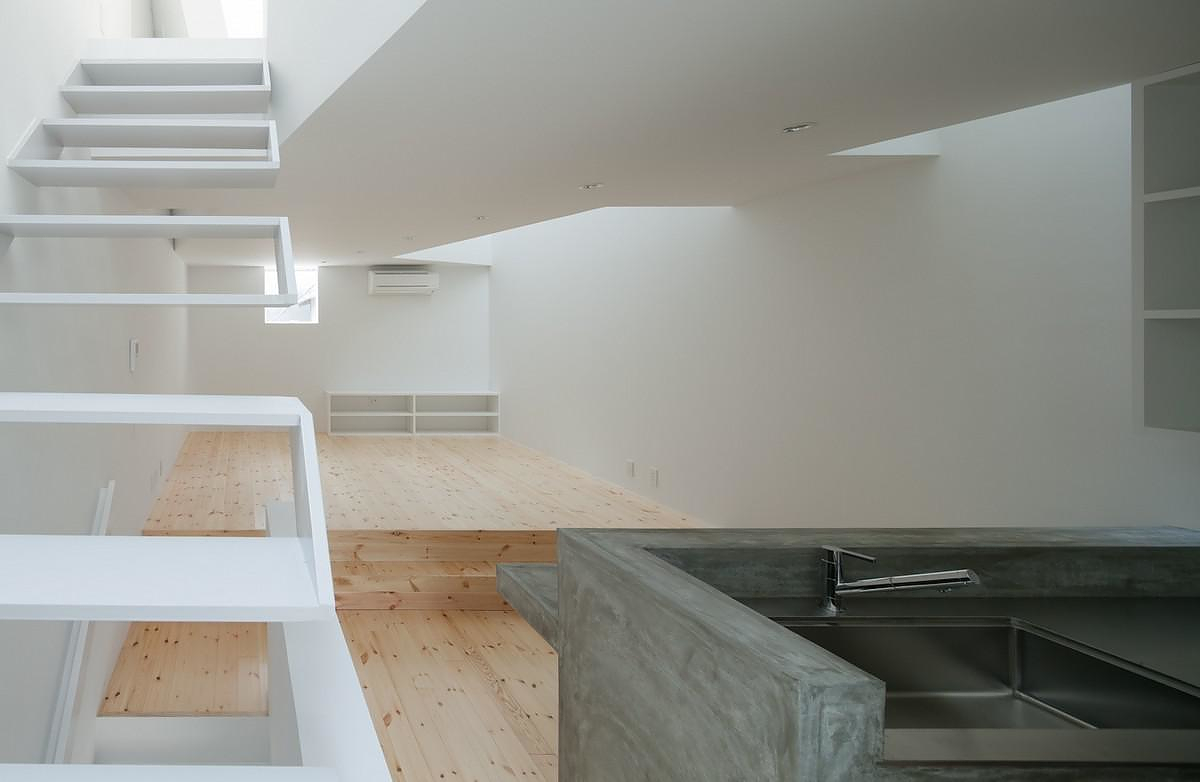
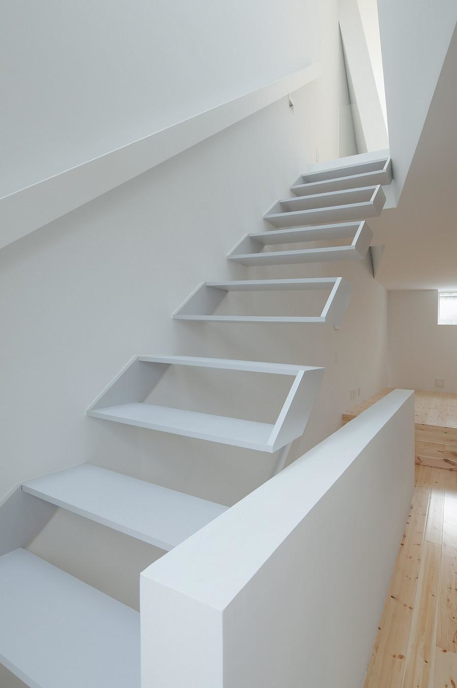
The vertical spaces created by the second floor’s openings were the ideal place to position the internal staircases. Kenji Ido designed and constructed these staircases in a way that allows the light to flow in. Their repeated box shape conveys a sense of lightness and also adds another impressive, yet minimal element to the project. The vertical wall of the staircase is also inclined by 14 degrees and folds at its upper part just like an origami. This structural element impresses the viewer and contributes to the unique character of the building. The minimal architecture of the staircase itself, with its box-like steps, allows the light to flow through from above and looks like a minimal piece of modern art. The staircase looks as if it is floating showered in natural light!
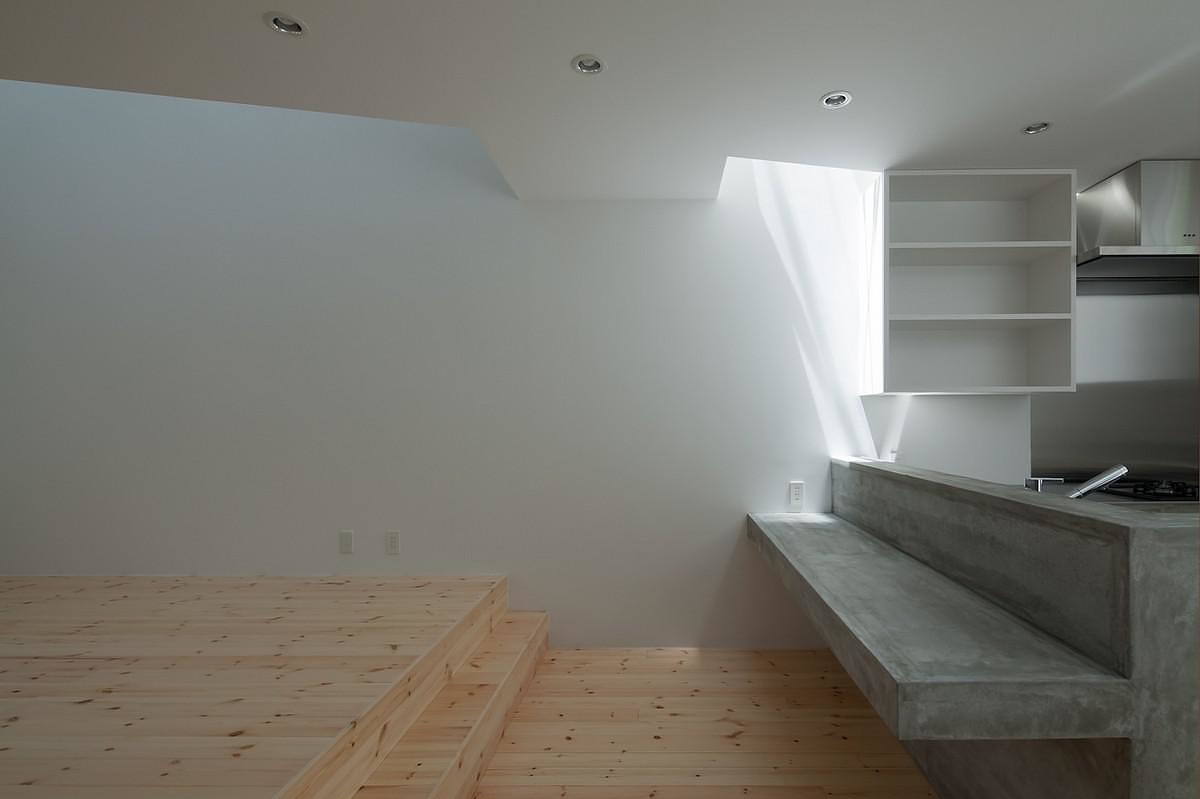
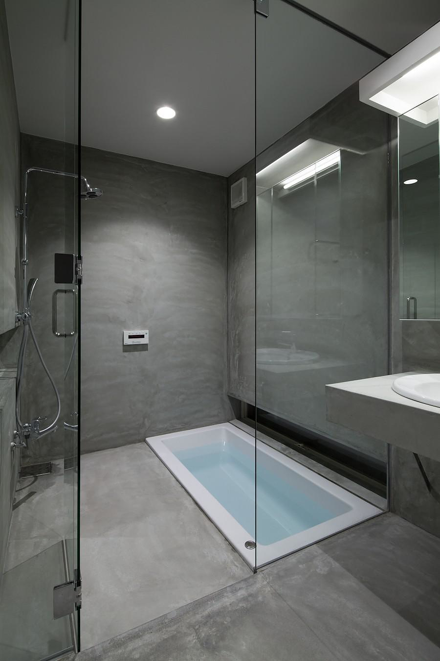
The materials used in the interior maintain their natural tints and textures in order to complement the relaxing atmosphere created by the flowing daylight. The kitchen counter is made by exposed concrete and the wooden floor boards are left in their natural shades. This architectural decision enhances the “subtle element” that characterizes minimal architecture, and remind to us, once again, how utterly minimal contemporary Japanese architecture is. Kenji Ido with his house in Tamatsu, presents a perfect example of this understated, yet impressively elegant architectural style.
Photo Credit: Yohei Sasakura


