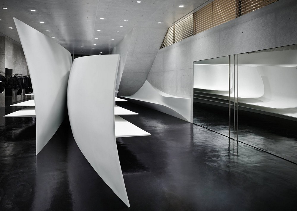
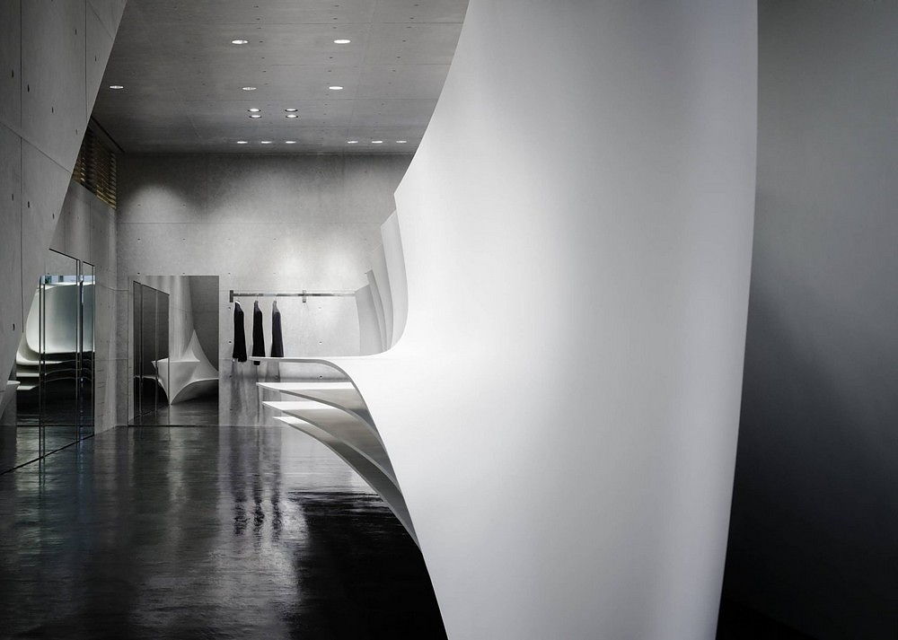
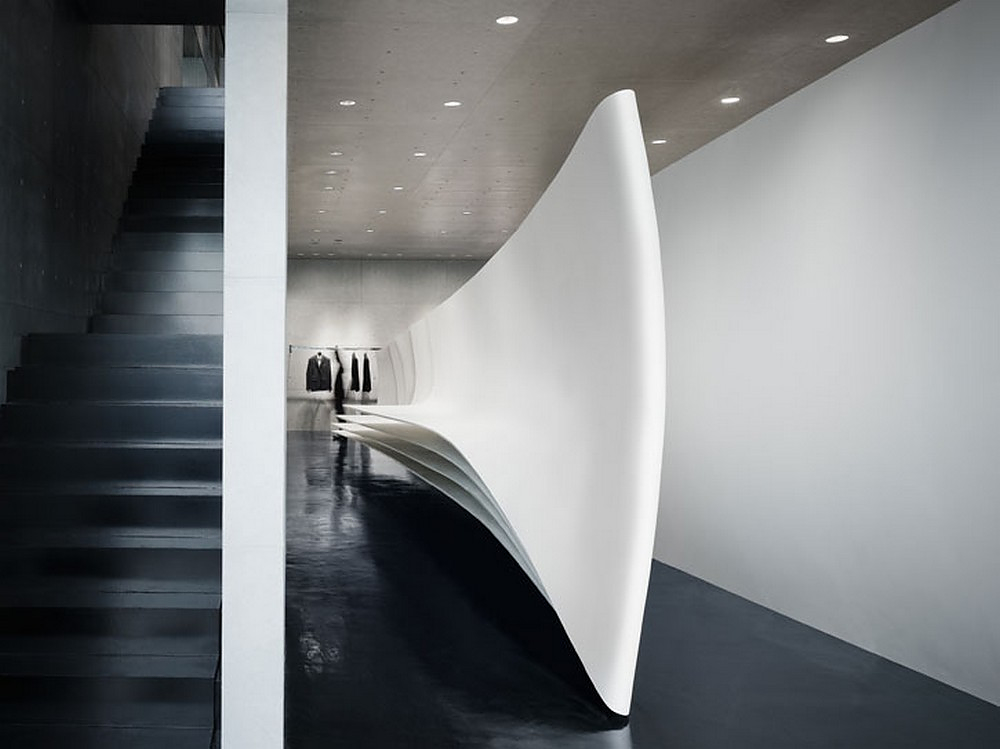
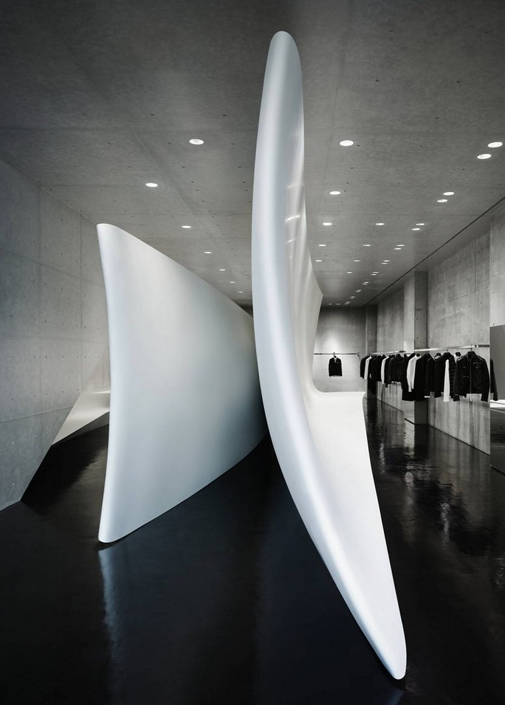
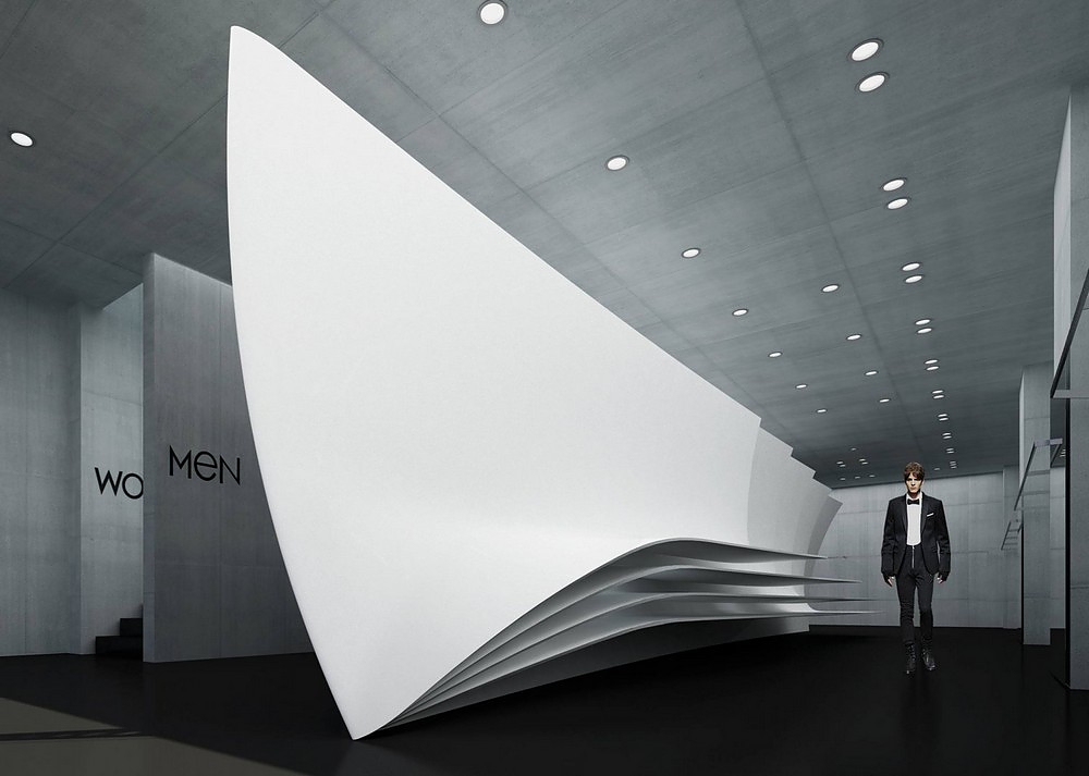
The Neil Barrett Tokyo flagship store is an exciting futuristic retail space that exemplifies in the best possible way Zaha Hadid’s signature architectural style.
The concept for the Neil Barrett Tokyo flagship store is based on the minimalist appeal of the brands’ distinctive fashion design. In actuality, it parallels Neil Barrett’s iconic style in using the same design parameters of fixed points, folding, pleating and cutouts.
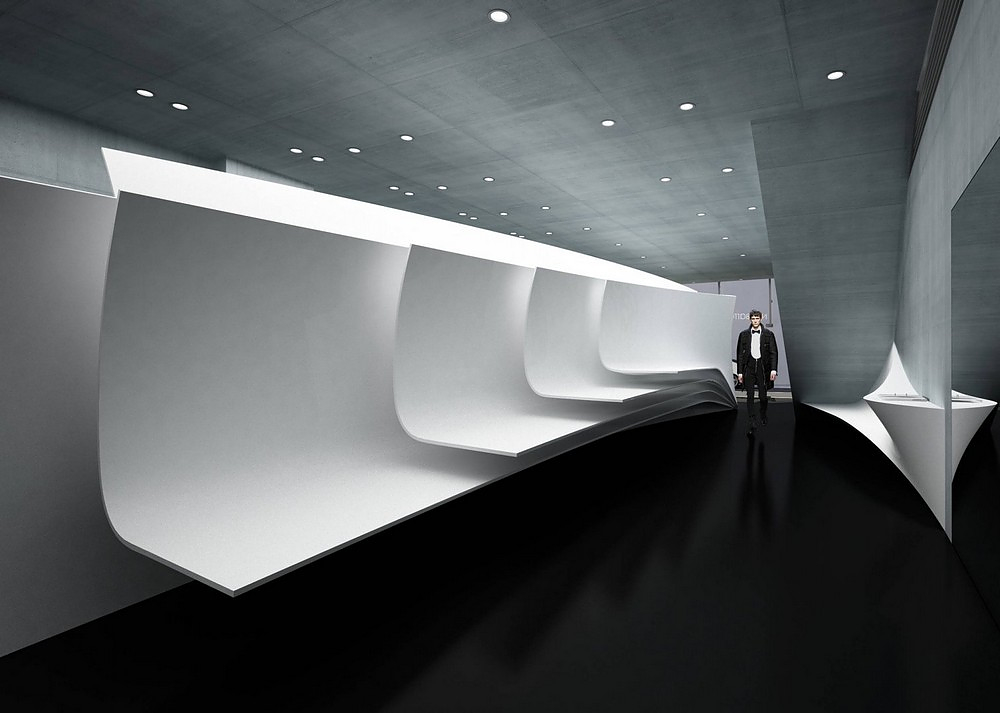
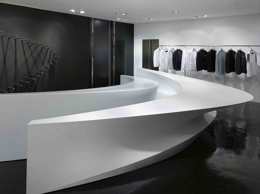
Rather than defining a single room or space, the layout of the store creates a circular passage allowing the customer to experience the space in multiple ways and interpretations.
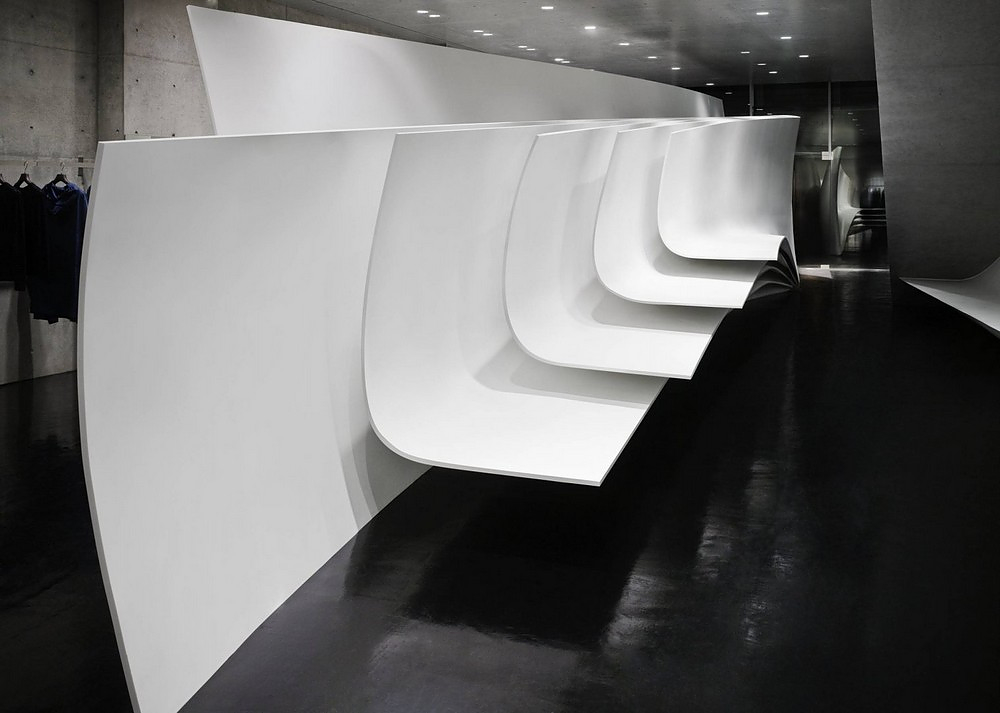
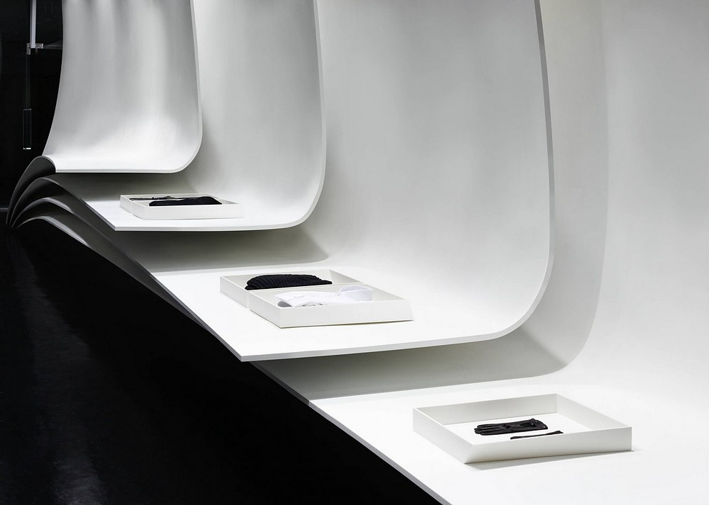
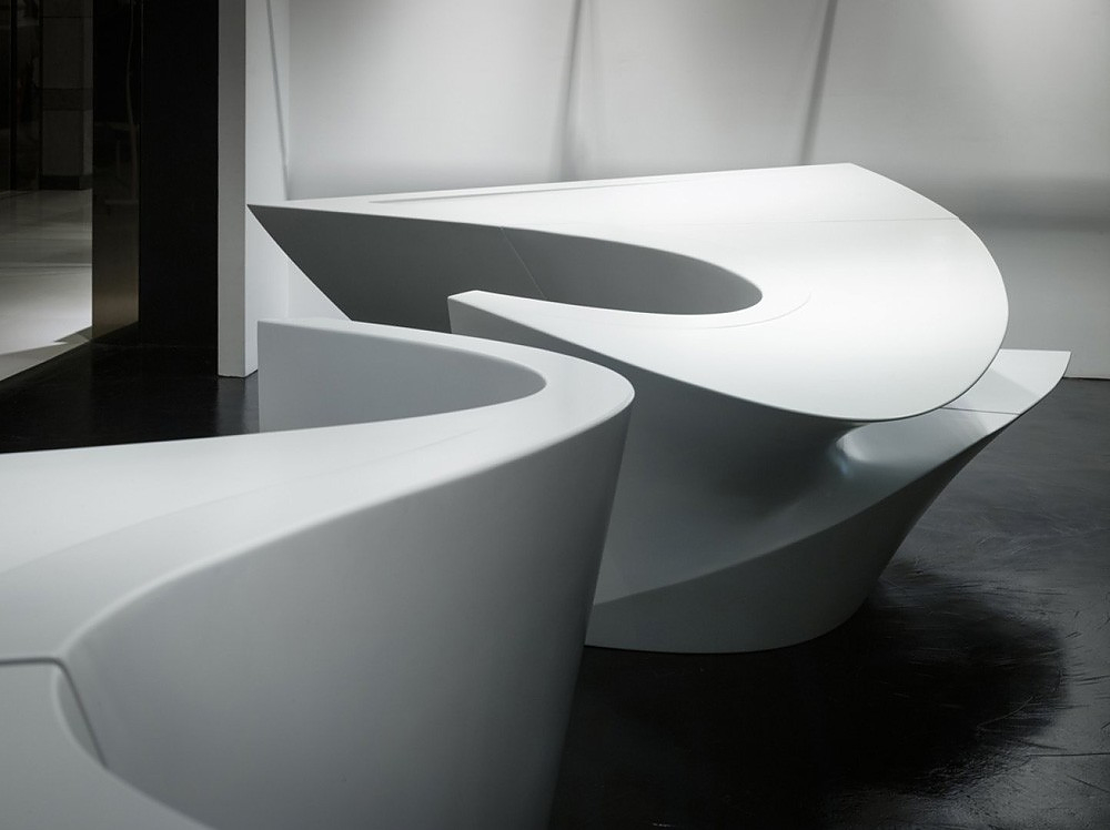
Furniture staged in key points throughout the store create the spatial concept of a narrow enclosure changing to an open condition. Effectively the shapes shift between architecture and sculpture in many instances. For example, a compact mass of surface layers unravel and fold to form the shelving display and seating.
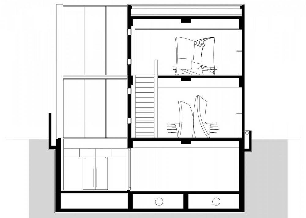
Another interesting aspect of the design is that it plays with the complementary characteristics and the related dualism between male and female. This is echoed in the furniture design on each floor. The furniture elements on the ground floor feature a strong, masculine and dynamic form, whilst those on the first floor enunciate femininity through more fluid contour lines. This design element is also emphasized through the contrast in color and finish of the white matte furniture finish against a black glossy floor, illustrating the interplay between male and female under a different perspective.
The store design was realized using the latest 3D modelling and CNC programming solutions, while the complex fluid surfaces were created using Corian, an innovative material with unique qualities.


